Having done my competitor analysis and background user research, I have decided to name my product Gig It by Press Up, encapsulating the client brand with a snappy (hopefully catchy) name. In short, Press Up Entertainment is a hospitality group operating cinemas, hotels, pubs, retail and restaurants based in Dublin, Ireland. Venues such as Workmans and Liquor Rooms which Press Up operates furthermore books and hosts gigs and live events. A dedicated music app hosted by Press Up will therefore firstly benefit the local music scene and community, and secondarily generate interest and patronage to its venues. Coming from a graphic design background, I was eager to create graphical assets for groundwork corporate branding. As I have done in my previous assignment (Di Mario’s Artisan Pizza), I designed a logo using the fonts present in the existing Press Up branding, Bebas Neue (logo primary font) and Futura (secondary font). I used material.io colour tool to select primary and secondary colours, which organised for me in a hex colour palette that I can easily pick from using the eyedropper tool while prototyping.
Competitor Analysis
Based on the four interviews that I conducted, outlined in my User Needs blog post (https://cryanyx.com/2021/02/21/user-needs/), there were several competitors identified by the users that I interviewed. Some of these named competitors had more similar functions and business needs as my web-app, and some were used alongside other applications. I believe that this type of live gig, band and venue booking app is quite a niche and novel one that hasn’t quite gained traction, locally. There is therefore no one industry-standard product for me to compare to. For this reason, I will analyse three apps that were identified in the interviews – ReverbNation, Instagram and Spotify. While ReverbNation perhaps has the most common business needs to what I would like to develop, I have included Instagram and Spotify since they are very popular apps that each have specific functions that I am interested in integrating in my product. I will be examining these apps in three parts – features, design and technology:
Live Music Gig Web App: Competitor Analysis
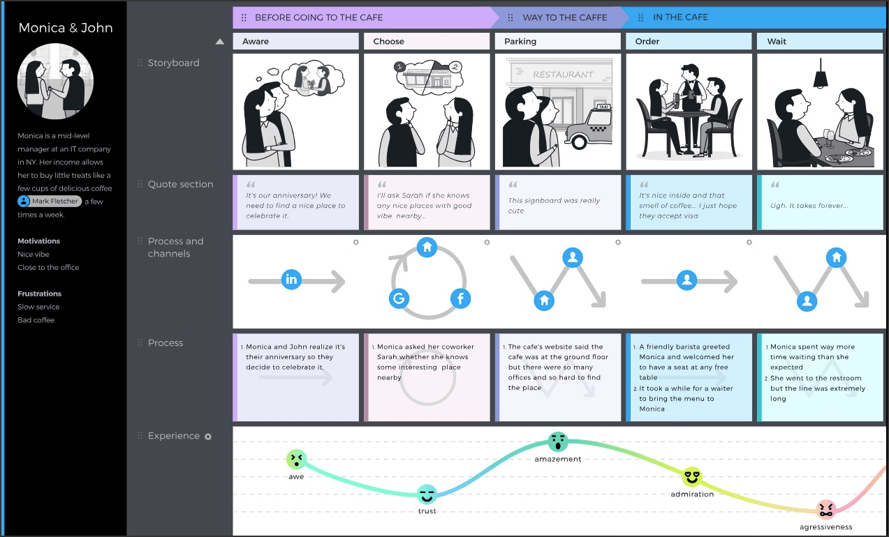
Since completing a detailed competitor analysis, I have created an augmented user journey map in the form of a UX storyboard for the user persona of Raoul in the current (pre-covid) context. The user task in this storyboard is securing a gig in a local venue to launch [Raoul’s] new album of original songs. His journey involves some competitors such as Spotify and Facebook, alongside traditional methods of networking within the music scene, as identified in the interviews I conducted. While this journey map is from the perspective of Raoul the musician, Conall the music booker who I also created a profile for appears in the journey.

Brainstorming & Story Development
Brainstorming is a process that most people have done in some form or other, most likely on paper to generate ideas. Indeed it is a powerful tool for coming up with not just ideas but solutions for potential risks and frustrations in developing a product. In this post, I would like to document two forms of a brainstorming exercise I have done for my PressUp live gig web app- a user centric or UX brainstorming, and a UI one. For this exercise, I have chosen to use Microsoft Whiteboard, a free and easy browser tool that allows me to write freehand into the app. It (pleasantly) also has sticky notes that simulate post-its commonly used in UX-research / design agencies . I would like to mention as well that Whiteboard allows sharing and collaboration which is especially useful in the the work-from-home Covid 2020/21 climate.
The process of UX brainstorming can generally be summarised in the following steps:
- Create Persona, User and Scenario
In this music app, more of my user research has been focused on the musician, although the venue is an equally-valued prospective user. I think that this is because there are more musicians seeking venues than the other way around as pointed out to me in one of my interviews. For this reason, I have decided to brainstorm for functions and solutions based on my User Persona, Raoul who I created in my last post. My user profile and scenario (user story) is briefly described in the blue post-its of my UX brainstorm. Ideally, where time and resources permit, I could have done two separate brainstorming sessions on both musician and venue. - Ideate
I listed some of the user needs based on Raoul’s profile, on the post-its in yellow. Based on these needs, I rapidly came up with ideas or plausible solutions to meet them, as shown in the green post-its. At this ideation stage, the researcher should be as spontaneous as possible, writing down ideas, however silly they may sound because sometimes great ideas come from crazy ideas! - Organise
Third in the brainstorming process is to organise these ideas. By grouping the the needs with the ideas (as I have done), I could more clearly think my way through and solutionise. After all, brainstorming is at essence, documenting thoughts and ideas in a visual way. - Solutions
While step 2 tends to be a crazy, spontaneous process, this step is a filtration process of taking out the unhelpful ideas, and restructuring each idea as an actual solution to a requirement of the app that we are building. In a sense, this step focuses the idea on the goal (final product). - Risks
Thinking of risks associated with your solutions / ideas are important. While a risk-free design is probably impossible, it is useful to be aware of possible pitfalls and avoid creating functions that have a great a risk, and affect the overall usability of the product. I have come up with some risks in the post-its in red.

Please open image in new tab to zoom in and read.
User Needs

PressUp Group plays host to dozens of live music acts each week. As such they have become a staple to the local music scene. They want to add some structure to gig planning, while providing a place for musicians to get recognised. They imagine an app that behaves like a “linkedin-lite for local music”. Bands can sign up to a profile to upload music, and fill out their gigging experience and CV. Venue owners can book bands from this profile and provide praise to bands who deliver a great show. An additional, bonus feature of this solution would be when a venue has booked-out night, a portal page is available to the public for purchasing tickets for that gig. Bands would then get a proportional cut of the ticket sales, and front of house staff would have a guest-list to fast track some people into the venue.
From the above brief I can identify two to three potential Users of such an app. As my primary focus would be designing a digital networking system for musicians, music bookers and venues to see each other and link up, they would be my key Users that I will be conducting my research on. The tertiary User would be the gig attendee, who could buy tickets on the bonus feature. I have previously worked for a music venue myself, as a Graphic Designer so I have some awareness of how gigs are organised but I have decided to conduct a few interviews with some friends to gain further insight into the industry to pin down the exact needs, frustrations and suggestions to make gig-planning easier. Here are the interviews that I have conducted (please open link to read PDF):
READ MOREProject Management for Software Development
In this term of my course, I have been given a new brief to research and develop a highly intuitive, and interactive web application:
PressUp Group plays host to dozens of live music acts each week. As such they have become a staple to the local music scene. They want to add some structure to gig planning, while providing a place for musicians to get recognised. They imagine an app that behaves like a “linkedin-lite for local music”. Bands can sign up to a profile to upload music, and fill out their gigging experience and CV. Venue owners can book bands from this profile and provide praise to bands who deliver a great show. An additional, bonus feature of this solution would be when a venue has booked-out night, a portal page is available to the public for purchasing tickets for that gig. Bands would then get a proportional cut of the ticket sales, and front of house staff would have a guest-list to fast track some people into the venue.
For 10 weeks I will be learning how to research and design, plan and pitch my product. The following 10 weeks would then be centred on actual coding and construction of this web-app to full functionality and interactivity. In using the Gibbs Reflective Cycle to evaluate the process of working on my last project (Di Mario’s Pizza), time management seemed to have been a recurring issue that either caused undue stress on myself, or impeded the quality of the final project when rushing through certain processes and not leaving sufficient time for iteration. Before embarking on my music app, I would like to spend some time practicing project management techniques to avoid similar, previous bottle-neck effect of workload.
As a visual creative, a Work Breakdown Structure (WBS) is a useful tool for me to visually map out all tasks involved in a project, mapping them out by hierarchy and some linearity. When I was doing the WBS I paid attention to breaking down the tasks in as much detail as I am able to anticipate. I have before, practiced a similar kind of planning exercise, namely in the form of list-making or “to-do” lists. The WBS I found, was far more structured and and organised, and I especially appreciate that it is easy for me to refer to (if pinned up on a desk cork board), due to it’s clear, visual appearance, compartmentalising and displaying all the tasks sequentially, unburdened by too much text. The process of creating the WBS was effective with familiarising myself with a brief and planning ahead- I was for example, able to make arrangements in advance such as finding people to interview. Here is my initial WBS, which I created on Adobe Illustrator (please open image in new tab to zoom in):

UX Storyboarding – Introduction
UX Storyboarding
For many (myself included, before embarking on this course), the word “Storyboard” leads us to think of tools that are used in Film & Animation, panels that look like comics, perhaps to illustrate or visualise a scene in a fictional story. In this post I would like to consolidate my learning introduction to storyboarding as a UX tool, used for a number of purposes in the software development process, and User-centric design. In the following 10 weeks or so, I will eventually be creating my own storyboard and project plan for a project pitch of an interactive Web App following a client brief.
Uses of UX Storyboard
There are several uses of storyboards in real-world User centric design. Firstly, it can be used as a technique to record or document User testing. Drawings and visuals can be used to chronologically illustrate the User navigating through a system / program, noting any pain points and body language. What the User says can be quoted as accompanying captions.
Secondly, storyboards can be a way of augmenting Journey Maps. In the first term of this course, we learnt about User stories and journey maps- A journey map is a visualisation of the process a User takes to complete a task, in the five phases of Consider, Explore, Compare, Test and Negotiate. “Coupling a journey map with a storyboard can provide insight to your story” (ref: https://www.nngroup.com/articles/storyboards-visualize-ideas/) and help the researcher further empathise with the User. In comparison to a journey map alone, the storyboard is more informal and perhaps a faster and more generic way of capturing the User journey.
Di Mario’s Website
Performance Analysis
On Di Mario’s Menu page, ChromeDev analyses that it took approximately 3.9secs to load 27 requests with a total size size of 12.4MB or resources. I can see that the menu item images took the longest time to load, with the largest file being 2.9MB. This particular image is 1500px in dimensions. While the images look nice and are coloured to match the site’s overall aesthetic, these images can be compressed more as it does not require full screen display and instead affects the load time of the site. On Lighthouse auditing tool, the site scores 62% on performance with its main suggestion being “properly size images” followed by “efficiently encode images” which reiterates that the main issue with the site’s performance is the size of images.
Week 9: Client Feedback & UX User Testing
In this week’s class, I was able to get some client feedback. Here were several issues raised after presenting my initial prototype:
- Checkout / Order page had too many headers that were visually contending for attention (cognitive overload). I need to better differentiate the order section from checkout.
- Date and time of “Last Order” should be added.
- Minimise paragraph on About page as it is too wordy.
- Add Value Proposition on Homepage. Client likes the description of “fresh, local, all-Irish produce” written in About page. This should be added to the homepage to identify a unique selling point of the brand.
- Reposition “Last Order” and “Favourites” button to be above the “Meal Deals” banner as it better serves its purpose for convenience and speed for regular/ returning customers.
- Change “You” login page to “My Account” as the indication of “You” is vague and unclear.
- Add more interactions to better illustrate and portray navigation and UX of the final product.
Week 8: Prototyping
Week 7: Survey, User Stories & Ideation
As introduced in the end of my last post, we created a survey investigating a broader group of Users’ experience ordering food online. We sent it out to 63 people and received 58 completed surveys back giving us the following final report which can be viewed here:
Survey Results: https://martinr.surveysparrow.com/public/reports/survey/87853/pMv4i4vc
The results have proven the following:
- 90% of users use a smartphone to order food.
- 61% prefer to check out their order as guests.
- Most common abandonment point of the process is when the website is too confusing.
- 76% of users choose their food based on text descriptions.
- 53% of users prefer a smaller menu to select from.
- Most users give a on-the-fence (3/5 on a scale) opinion on the statement “Most websites take too long to complete your food order.”
- Most users (although not by much) are willing to trust less well known brands.
- Most users expect 10 – 15 clicks to complete a food order.
- The most popular priority during the process is live price update.
Week 6: Mapping Empathy
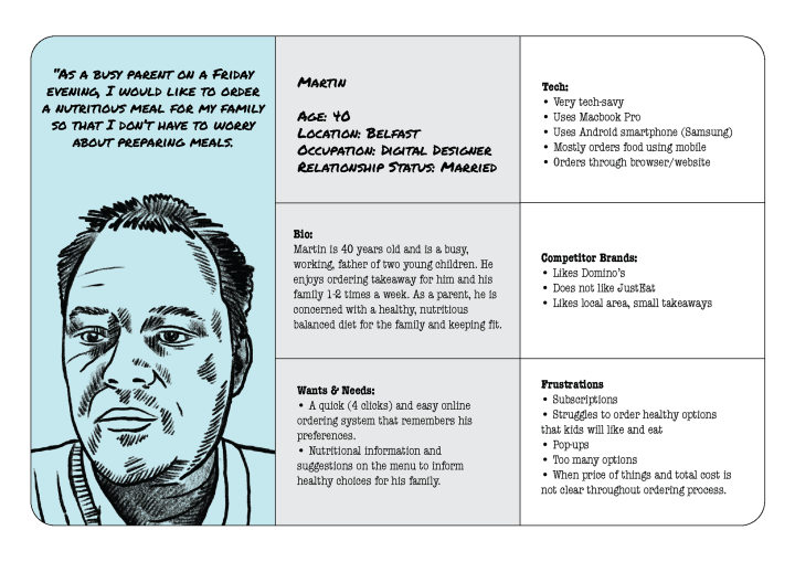
In this week’s session, we developed the following based on our tutor, Martin:
• 1 User Persona
• Conduct User Interview & User Task: Order food on Apache website
• Identify pain points and issues with site from user interview / task
• User Stories based on Persona
• Create Empathy Map based on Persona
• Create a User survey as a group to send out to at least 10 – 20 Users
Based on a short description Martin gave of himself, I created a User Persona to work off, for the interview and finally the Empathy Map:
Click here to enlarge.
Part 1, Section A: UI/UX: Wireframes & Prototypes
In the third part of my first assignment, I have constructed wireframes for each of the case study brands using drawi.io as it is a free and easy introductory program to wireframing. Other programs that I have been recommended by UX designers, that I would like to try are Figma and Adobe XD which I may have a go at, in the prototyping phase. Draw.io however, has proven to be easy to use, intuitive and uncomplicated in its click, drag and drop functions. It also allows you to save each project to your Google Drive and design multiple pages for one site, linking them together with button paths.
For each of the brand, I have done a quick sketch on paper first before construction on draw.io. As it is my first time drafting up wireframes, I found sketching it out useful to have a general structure in my mind before opening the program. In my experience working as a digital designer, a pencil sketch is my go-to first step for the design process. As evident in the wireframes below (they are presented in the same chronology as how I made them), the outcome gets better with each time I use the program, proving immediate improvements from every practice. Read More
Part 1, Section A: UI/UX: Colour, Font Choice & Readability
Colour
Thindi adopts a complicated, contrasting colour palette for its website. While its logo uses Red and Yellow, these colours are not referenced in the website. Instead, I find Orange (#fc6e1f) to be the primary colour even though it does not command the most visual weight on the page. I come to this conclusion because the key buttons (Order Online) are coloured Orange to draw attention and it is the first noticeable block of colour on entering the homepage. Moreover, Orange seems to have been used to match a lot of the food photography of their curry dishes. I find orange to be quite a common colour used on food websites (ie. JustEat), as it is an organic colour found in food, although on Thindi it is much brighter than organic. Orange is appropriate for an Indian takeaway as it evokes a sense of heat and spice in cooking. The brightness emotes energy and optimism, feelings of which consuming food should give you.
There are blocks of two other colours on this homepage- Turquoise (#14a892) and a deeper Maroon at the footer (#4f0504). On the colour wheel, the contrasting colour for Orange is Blue so Turquoise is theoretically a good choice for a secondary colour for contrast. However, this scheme is a complicated one coupled with a tertiary Maroon colour, none of which are in the brand’s logo. I appreciate the bright pops of colour throughout this website but I feel that the choices are disparate and can be unified more so as to not distract the eye while navigating through.
My suggestion for design improvement for Thindi’s website is to use the logo’s Red as the primary colour and Turquoise as its contrasting, secondary colour- used only as an accent. Maroon should be used as a darker complimentary colour to the primary logo Red, perhaps just for text or on a smaller footer and or navigation bar (refer to below diagram).
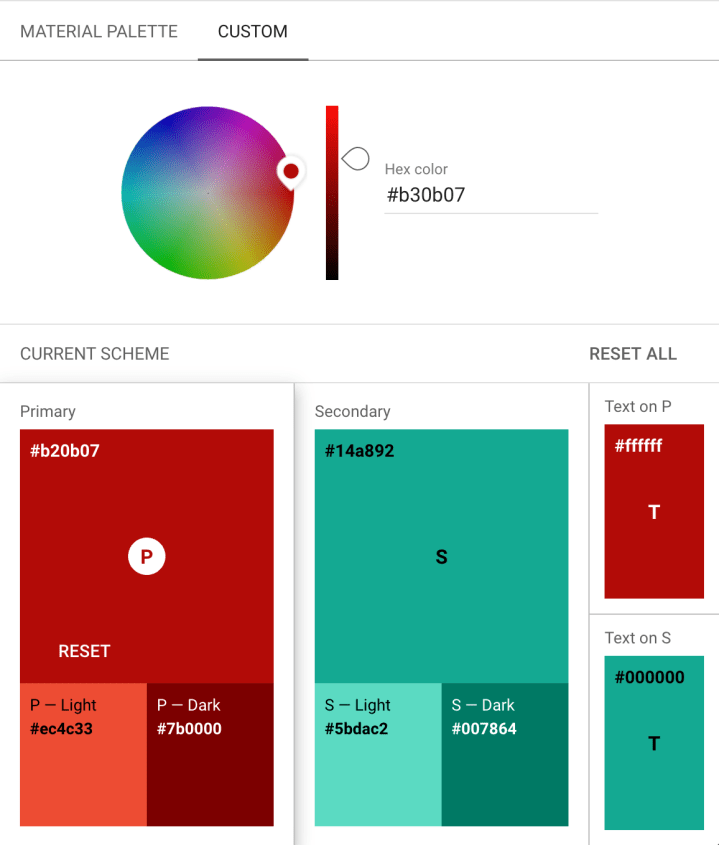
(Source: Material Desing: Color Tool https://material.io/resources/color/#!/?view.left=0&view.right=0)
Part 1, Section A: UI/UX Nielson’s 10 Heuristics
In this exercise we are given a sample client brief: a new brand who is looking for Web Design consultation to launch their new website to coincide with the opening of their new restaurant. The brief outlines three primary goals:
- Create an online experience to entice people to come in and visit their new restaurant in Dublin.
- Attract people to work for the restaurant.
- Providing the media with information needed to do an initial review of the restaurant.
The client brand DiMario’s is a wood fired pizza specialist, with a target audience of a younger demographic consisting of college students, news and social media, influencers, families and potential employees. The objective of the brief is to create a functional website that is interactive, clear and delightful to use while being accessible and adherent to modern trends. Here are some of the site features the client would like, outlined in the brief:
- Pages should include: Home, About, Menu and Careers
- Optimised for mobile device access
- Some drop-in interactivity
- Rich image gallery and PDF Menu download
In this part of the exercise I will be using Nielson’s 10 Heuristics to assess 3 brands similar to DiMario’s to conduct Market Research and Competitor Analysis. The objective of this exercise is to utilise the Heuristics as a tool to preliminarily examine websites according to a set, standardised grading system that can be done by the UX researcher, him or herself. As defined by Wikipedia, the term “Heuristics” is a term to describe “an approach to problem solving or self-discovery that employs a practical method…sufficient for reaching an immediate, short term goal or approximation.” (ref: https://en.wikipedia.org/wiki/Heuristic) The 3 brands that I have chosen for this research are distinctively different from each other, broadly covering the competitor market for DiMarios’s:
- Thindi – Dublin’s new, local Indian takeaway restaurant in Glasnevin
- Domino’s – Global household brand
- Bao London – A successful, award winning London-based food business owned by a personal friend of mine.
I have designed a scoresheet (please open image in new tab to zoom in) which will function as a checklist for the 10 Heuristics. On this I have noted down issues, comments and recommendations. After each brand assessment, I will highlight the pros and cons of the website, throwing a spotlight on key usability strengths and issues that I encountered while completing the user task of ordering food for delivery on the website. Read More
Part 1, Section B: Web Design
For this assignment, we are given a sample client brief, a new brand who is looking for some web design consultation. The client is a new wood-fired pizza restaurant and takeaway, Di Mario’s who is looking to launch a website alongside the opening of their new restaurant and takeaway. For this research assignment, we are tasked to analyse 3 similar brands that I can reference for comparison, inspiration and similarly, things to avoid in Web and App design. I will delve more into the UX/UI side of my research in my subsequent posts which will cover usability, design, wireframes and prototypes. For this post, I am focusing on web design principles, examining 3 real-world case studies from a front-end development standpoint, questioning- what does a good food and dining experience look like on a website and app? How do I recreate that for my client?
Many new restaurant and food businesses now use websites and apps, especially with the heavy consumption of takeaway and delivery, to promote and advertise their food and dining experience. It is quintessential that my client brand adheres to industry standards of functionality, efficiency, design and construction for its website and app to launch with a competitive edge. In my research I will be looking at Thindi (Dublin, local), Domino’s (global) and Bao London (a personal friend’s successful London-based food business). I will be focusing on three areas of analysis:
- Animations, Interactions & Behaviour
- Behaviour on Mobile Devices
- Accessibility, Usability and SEO
Thindi
1. Animations, Interactions & Behaviours
The website is fairly minimal in design and could afford to have more animation and interactive features for greater delight in browsing experience. I however enjoy the clean layout and especially the sections of text boxes overlapping images. The site uses 3 contrasting, block colours (#fc6e1f, #14a892, #4f0504), clearly demarcating sections and text boxes. The homepage has a large banner (div.content-wrapper) that has a look-book style gallery of attractive food photography that “flicks” through on its own. I found the body text a little too large (16px) for a basic (Avant Garde Gothic Pro) sans serif font. The ordering site which seems to be separately hosted by Mobi 2 Go had more animation features with a rollover buttons on the menu pages. This feature is handy in making it clear to the user that an item is “clickable” or about to be selected.
In ChromeDev Tools I have identified that the website takes approximately 2.26s to load 78 requests, 17.4MB resources and 12.9MB transferred. I have identified one linked script fbevents.js that is blocked but takes 174ms to load- this should be removed. I have also noticed that scripts are at the top of the waterfall, suggesting that the scripts load first before the other types of files and links.

UX Research: User Interview & Test: ASOS
“Although functionality is still the top priority, now digital products are also required to be user-friendly and visually appealing.In this context, UX (user experience) testing is a cornerstone of the product’s lifecycle.”
Brooke, Sophia (2018) The Essential Toolbox of UX Testing Methods
https://uxplanet.org/the-essential-toolbox-of-ux-testing-methods-6e8e564768c3
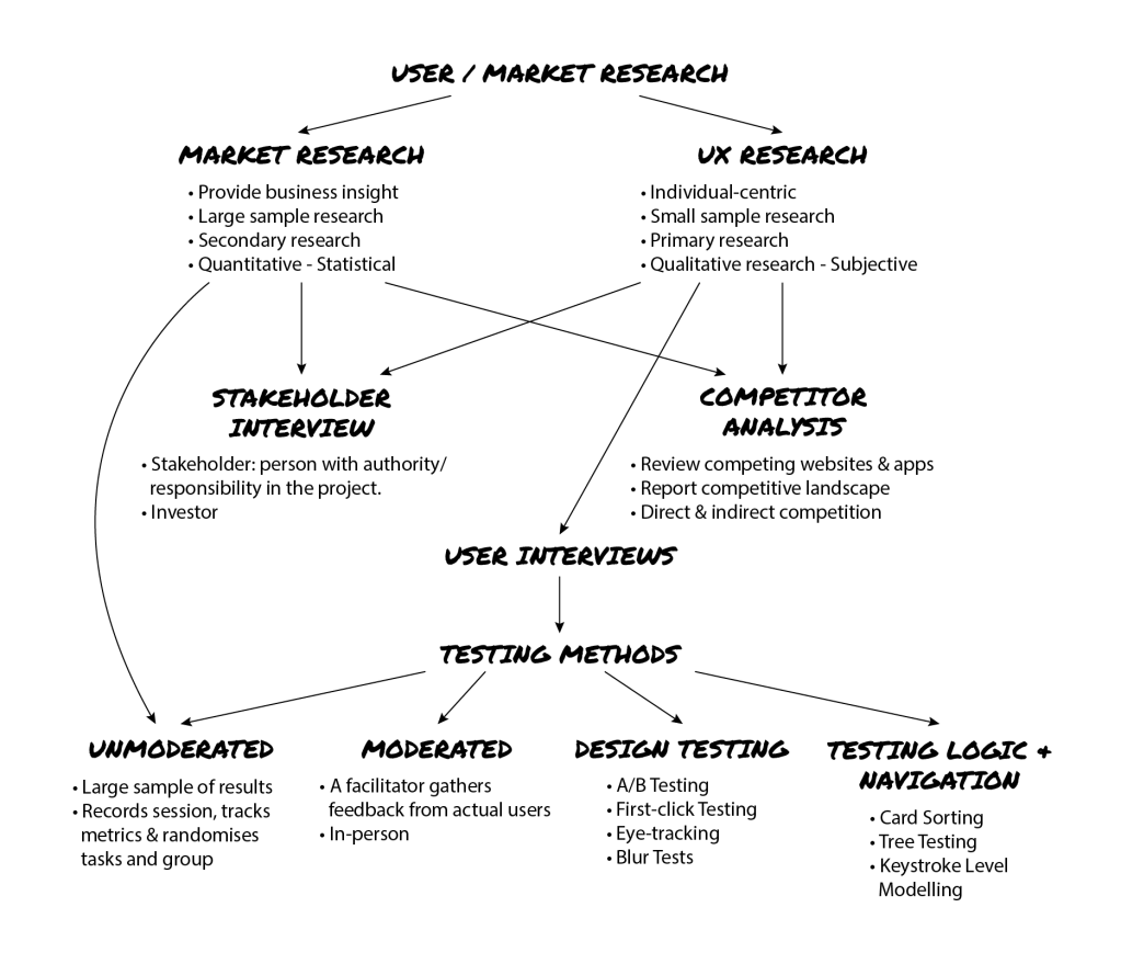
UX design and research is extremely important in the improvement of digital platforms to keep up with the expanding and rapidly modifying competitor landscape. For corporate businesses, it gives insight into the consumer market, realising behaviours, wants and needs- sometimes very personal, nuanced and even subconscious. It is the role of the UX designer / researcher to explore these subjective behaviours and opinions, and qualify them in data that can instigate action and steps to improve the experience of a given product.
I have summarised User Research, its types, means and purposes into the following flowchart for my personal reference:
Site Map & Personas – What’s Cooking?

Just Eat App
Being a person who frequently orders takeaway, I find myself using takeaway apps 1-3 times a week. The three most popular food delivery apps in Dublin are Just Eat, Deliveroo and Uber Eats, the former two of which I use. In this post I would like to do a small review of Just Eat and point out one inconvenience I find in the app which can be improved. Admittedly, it is the most popular and dominant food delivery app that has brought a lot of convenience to my life so while there is room for improvement, it is unlikely that I will ever stop using it.
Firstly, I love the layout of the app and I like that my orders, addresses and payment methods are saved for quick re-orders of the weekly usuals. All this can easily be accessed in the drop down menu on the top left corner with clear pages – Find Takeaways (search), Orders, For you (offers), Settings, Help and Log Out. I also like the bright orange icons and simple but eye-catching illustrations of the different food cuisines. I personally like the orange colour used for food-related packaging and marketing as it is a warm colour that reflects a lot of the earthy colours in food (ie. brown, yellow, white, orange, red). As you browse through the different restaurants on the app, you will scroll through many images of food photography that will whet your appetite if you weren’t already hungry.
There is just one annoyance that I have with Just Eat that I have experienced: Sometimes I browse for new takeaways that I have not tried before on Chrome. When a takeaway does not have its own website for you to view the menu, you are directed to the Just Eat app. This is where it gets problematic because when the Just Eat app launches, it does not go straight to the restaurant’s menu. You will then have to go through the following steps:
1. Enter your address
2. You will be directed to a page with all the restaurants available in your vicinity
3. Find the search bar to type in the restaurant you were originally looking for
4. Search Read More
