Performance Analysis
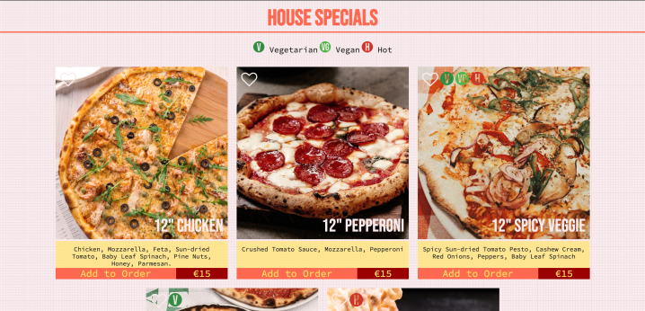
On Di Mario’s Menu page, ChromeDev analyses that it took approximately 3.9secs to load 27 requests with a total size size of 12.4MB or resources. I can see that the menu item images took the longest time to load, with the largest file being 2.9MB. This particular image is 1500px in dimensions. While the images look nice and are coloured to match the site’s overall aesthetic, these images can be compressed more as it does not require full screen display and instead affects the load time of the site. On Lighthouse auditing tool, the site scores 62% on performance with its main suggestion being “properly size images” followed by “efficiently encode images” which reiterates that the main issue with the site’s performance is the size of images.
The site uses some basic interactions to enhance the User Experience (UX) such as the :hover selector applying a change of background and text colour. The site uses JS to collapse the nav bar when the screen width falls below 500px. This is useful for optimising the site for mobile device access. The menu has a heart (favourites) icon that can be clicked and it changes to a red heart. This is a feature that is more commonly used in fashion retail sites and I felt that it was good element to add to a food website. Another suggestion that Lighthouse made is “eliminate render-blocking resources”. In this site I used a few resources such as Awesome Font (icons), JQuery and Google Fonts. I applied the links for these on every page and some pages may not require the resource. The website can be finer-tuned by removing non-critical resources (HTML) and unused JS in of each of the pages.
:hover and :active selector.
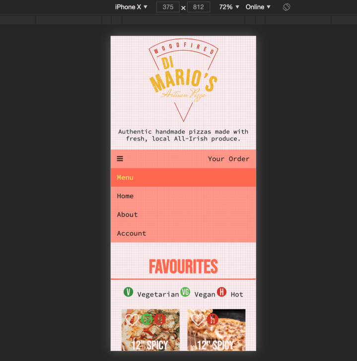
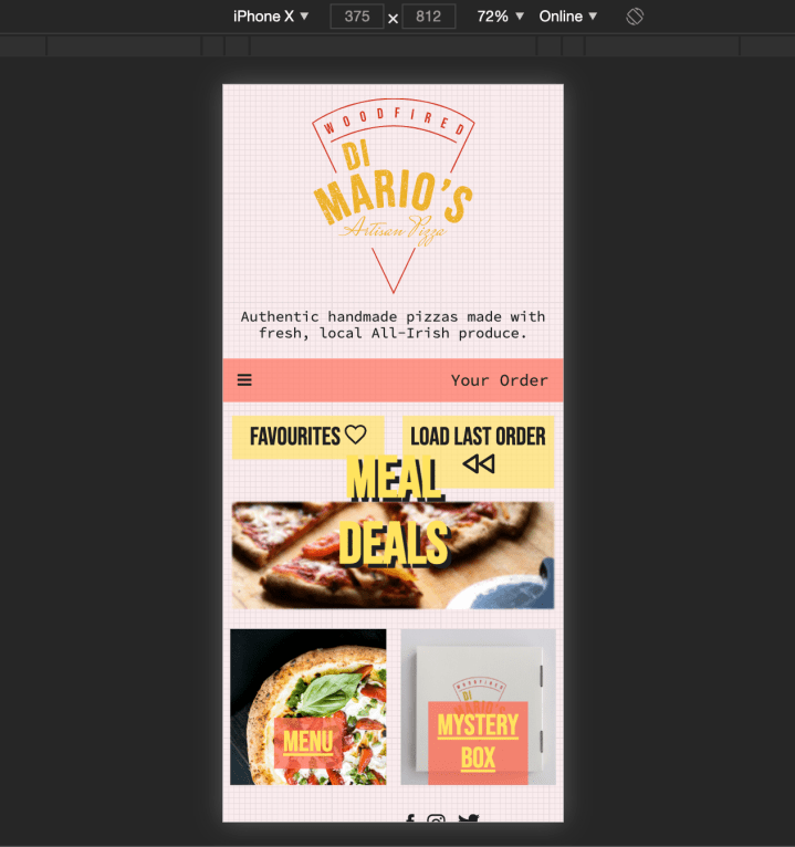
There is some responsiveness that was applied to the website using Media Queries. However I set my media query max-width at 500px and when I accessed the site on the phone, some elements were clearly still too big. A media query can be applied to the header logo as well as it takes up half of the screen on the phone. I would like to point out two instances of successful responsiveness, first being the nav bar and also the resizing of the contact and payment forms. Although Lighthouse rates the site 82% for SEO, I know that I did not add any SEO into the code and simple meta tags can be added to identify the site better. There is however clear branding such as the slogan “Authentic handmade pizzas made with fresh, local all-Irish produce”, and keywords in the description on the About page. These are opportunities that can be added into the site’s SEO. Considering social media influencers to be one of the target audiences in the client brief, more can be added to the site to link it with sites like Twitter and Instagram for greater promotion and opportunities for customers to review.
Colour, Font & Readability
As the website is not yet a fully functional one, I cannot evaluate it with the full 10 Heuristics. I will however, highlight some good and bad points in the site, using the heuristics. On Visibility of System Status, I am admittedly limited in web development skills to integrate a live cart with update notifications. However, a simple modal-box (no JS required) can be added for the menu page with the message “Item added to cart” when “Add to Cart” button is clicked. Overall I think that I have used good food images (source: Pexels) to showcase the menu items and also a text description of ingredients. I have also added icons for dietary information, in order to satisfy “Match between system and real world”. On number 8, Aesthetic & Minimalism, I tried to keep my design aesthetic clean and simple, referencing one of the sites that I researched (Thindi). In seeing the site as a whole on my browser, I am happy with the bright and clean layout. However, I feel that images can be scaled more appropriately so as not to take up the whole screen, making it hard for the user to visually focus. More margins can be added between the images on the homepage. Lastly, while there is a contact page with an address and phone number for the restaurant, a direct link to contact information can be better featured through out the page, perhaps using a phone graphic icon, as it is an important feature for Help & Documentation, especially in an online food ordering process.
appropriately sized.
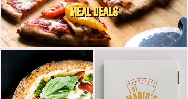
I adhered to my colour choices (which I will detail in my summary) closely in the construction of the website, to achieve some contrast with bright imagery (which I colourised on Photoshop with a violet filter) against the pale pink background. I tried to accentuate contrast on the nav-bar, using the bright coral and yellow against each other for the hover selector, which I found quite effective, creating almost, a glow effect. The font choice of Bebas Neue (Google Fonts) was effective as headers as it is impactful, using the darker tones of my colour scheme, without having to add much HTML and CSS to make embolden it further. There can be more improvement in some areas of readability such as the “Meal Deals” text over the banner image on the homepage and menu items’ names, overlaid on food photography. While it does adhere to the colour and design aesthetic, it is a bit lost on contrast and readability against high-resolution images. I added a slight blur on the banner image on the Homepage to push it back but not enough to make the text link sufficiently stand out. As I primarily used a responsive flex grid with percentages for the menu items (Menu Page), I am happy with the symmetry and balance of the layout, also creating a Z-viewing pattern for readability. It is not however fully responsive for some of the text elements on the Checkout Page and more can be done to tighten this symmetry for mobile device access. Lastly, I did not add any animations or videos to this site and perhaps some embedded gif elements (ref: Bao London) or an animated image gallery banner (ref: Thindi) can enhance and delight the User Experience.

Summary of Development Process
On my choices of colours and design aesthetic, I wanted to adopt a clean, sharp and minimal scheme. I wanted to design something that had the trendiness of Bao London, adding more colours and integrating the clean minimal layout used in Thindi, alongside attractive and stimulating food photography. I liked the practicality and functionality in the Domino’s website, so I integrated a similar layout in the Menu page. I wanted to use bright pastel colours while keeping the representation of food on the website appetising and organic. My primary brand colours were a Terracota Red (#D33226) and a yellow-ochre (#EDB129) to reference two of the main ingredients in pizza – tomato sauce and cheese. I used Material Design Colour Tool (material.io) to generate a colour scheme which I easily picked from in the construction of my prototype and website. In the process and designing and constructing this website, I found the UX process very inspiring and informational. I learnt that having a hi-fidelity prototype designed, the process of constructing the website in code is very informed and procedural, barring the challenges of learning and applying the three web design languages. I feel that the website that I finally produced met my expectations from a design standpoint. It was however, frustrating to be unable to create functions and add interactions that I wanted to because I still have much to learn with coding.

Material Design Color Tool (material.io).
In conclusion, upon performing web analytics on the site I built using Chrome Dev, Lighthouse and Nielson’s 10 Heuristics, the strengths of the site lay in its design aesthetic and perhaps informed colour choices. It can be improved further however, with more attention to the readability of text, especially in relation to working with images. The site suffers in performance with images inappropriately sized for upload and misuse of CSS and JQuery links. The responsiveness of the site, while present, is incomplete and more needs to be done to encompass all elements of UI. The key changes I would like to make to the website are:
- Increase responsiveness for mobile devices by elaborating media queries to include all elements of UI.
- Compress and optimise all embedded images.
- Add SEO meta tags with further suggestion / feature of links to social media platforms.
- Add motion graphics and further interactions (in moderation) to the site.
- Complete site’s e-commerce functionality with a functioning shopping cart and checkout upon greater understanding and learning of JavaScript and JQuery.
 Play Pretend