For this assignment, we are given a sample client brief, a new brand who is looking for some web design consultation. The client is a new wood-fired pizza restaurant and takeaway, Di Mario’s who is looking to launch a website alongside the opening of their new restaurant and takeaway. For this research assignment, we are tasked to analyse 3 similar brands that I can reference for comparison, inspiration and similarly, things to avoid in Web and App design. I will delve more into the UX/UI side of my research in my subsequent posts which will cover usability, design, wireframes and prototypes. For this post, I am focusing on web design principles, examining 3 real-world case studies from a front-end development standpoint, questioning- what does a good food and dining experience look like on a website and app? How do I recreate that for my client?
Many new restaurant and food businesses now use websites and apps, especially with the heavy consumption of takeaway and delivery, to promote and advertise their food and dining experience. It is quintessential that my client brand adheres to industry standards of functionality, efficiency, design and construction for its website and app to launch with a competitive edge. In my research I will be looking at Thindi (Dublin, local), Domino’s (global) and Bao London (a personal friend’s successful London-based food business). I will be focusing on three areas of analysis:
- Animations, Interactions & Behaviour
- Behaviour on Mobile Devices
- Accessibility, Usability and SEO
Thindi
1. Animations, Interactions & Behaviours
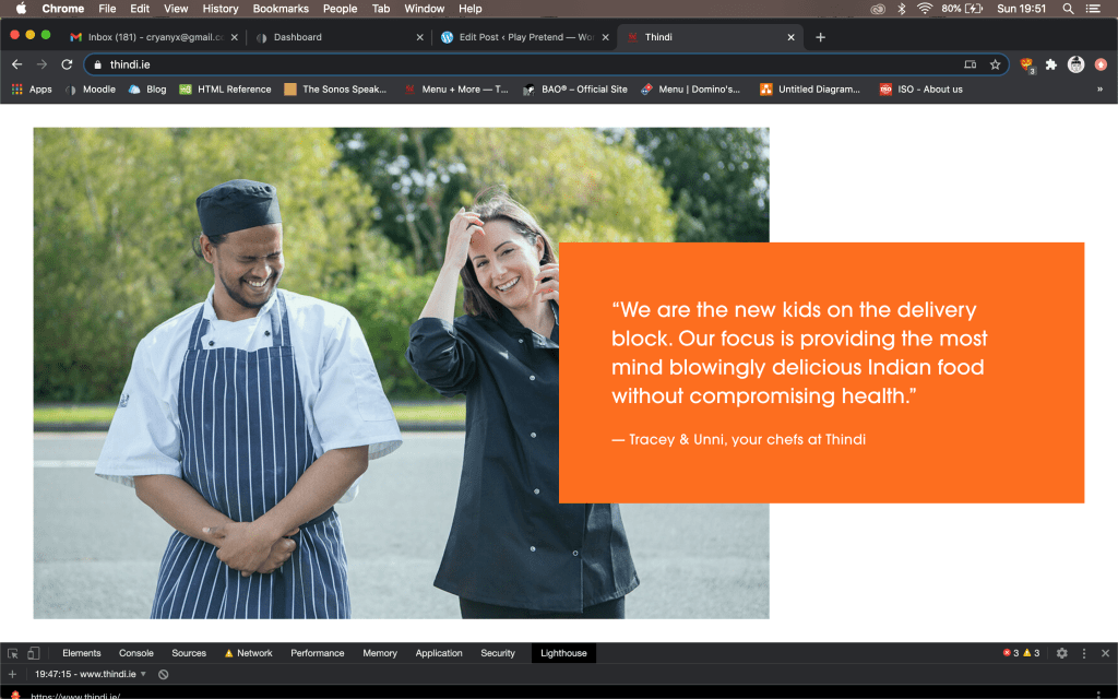
The website is fairly minimal in design and could afford to have more animation and interactive features for greater delight in browsing experience. I however enjoy the clean layout and especially the sections of text boxes overlapping images. The site uses 3 contrasting, block colours (#fc6e1f, #14a892, #4f0504), clearly demarcating sections and text boxes. The homepage has a large banner (div.content-wrapper) that has a look-book style gallery of attractive food photography that “flicks” through on its own. I found the body text a little too large (16px) for a basic (Avant Garde Gothic Pro) sans serif font. The ordering site which seems to be separately hosted by Mobi 2 Go had more animation features with a rollover buttons on the menu pages. This feature is handy in making it clear to the user that an item is “clickable” or about to be selected.
In ChromeDev Tools I have identified that the website takes approximately 2.26s to load 78 requests, 17.4MB resources and 12.9MB transferred. I have identified one linked script fbevents.js that is blocked but takes 174ms to load- this should be removed. I have also noticed that scripts are at the top of the waterfall, suggesting that the scripts load first before the other types of files and links.

2. Behaviour on Mobile Devices
When I accessed Thindi on my mobile device, the layout and features appear to be the same as on the browser (considering the website is generally simple by design). I do not feel that the site is fully adapted for mobile device screens as Some of the images appear to be cropped in the gallery images but it is not overtly noticeable or visually disturbing.
The load time on a mobile device, fast 3G network took approximately 19s and taking up to 30s for the images to start changing on the banner. This is quite poor performance. Some of the images while lovely to look at are very large for a mobile screen (and on a slower, less reliable network). The largest image is a 1.2MB sized png file that took 17.13s to load. Perhaps images can be further scaled down for optimal mobile device use. Otherwise, would it be possible to remove the gallery and just have one static hero-image in place?
On Lighthouse auditing tool, the website faired poorly for mobile device access with a performance score of 24%. The time it took to interact with the website was 10s. The lead suggestion that Lighthouse gave is to remove unused Java Script with an estimated time saved of 3.95s.
3. Accessibility, Usability & SEO
I was unable to find any keywords on metadata tags in this website which explains why, when I search “Thindi” or “Thindi Dublin” in Google, the website (not Facebook page) does not come up in the first page of results. This is a great opportunity loss that can easily be rectified by adding some relevant keywords such as “Thindi”, “Indian”, “Takeaway”, “Dublin”, “Glasnevin”. As the restaurant is only recently launched, I assume that the website is still a work in progress and the brand is preliminarily advertising through their Facebook page, where SEO is embedded in the platform.
I did notice several Twitter metadata tags. Coupled with the heavy reliance on Facebook, I infer that the brand is attempting to trend and promote itself on social media. Thindi is perhaps using its millennial branding to reach out to local influencers to promote their food. Consumer vs Influencer, Trending vs Evergreen (REF: https://www.searchenginejournal.com/seo-guide/seo-strategy-trade-offs/) are common tradeoffs that we can observe in new businesses that target the younger, social-media savvy consumer.
Lighthouse tool has given Thindi a 92% SEO rating. It does note however, that “there are additional factors Lighthouse does not check that may affect your search ranking”.

Domino’s
1. Animations, Interactions & Behaviours
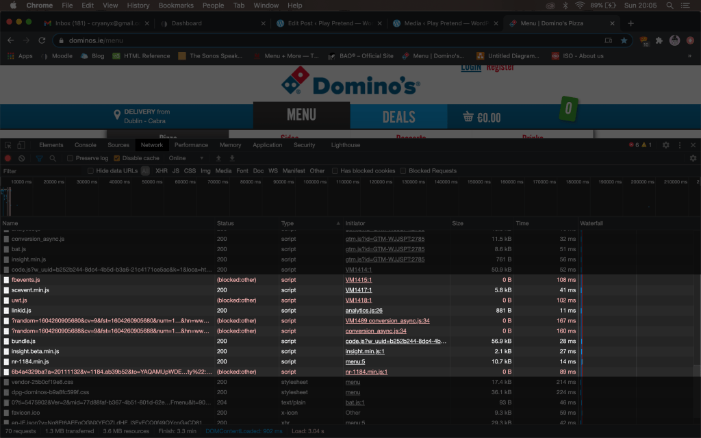
Domino’s website is very brightly coloured with animated effects through out the navigation of the page. For example, the navigation bar at the top has a rollover buttons that change from blue to red (Domino’s primary brand colours) when your cursor hovers over. With a load time of 3.04s for 69 requests, I find the site fairly optimised for performance. In Chrome Dev I have identified 5 blocked scripts- this should be removed. Interestingly, I found the same fb.events script that I saw on Thindi’s website.
When you access the website there is a pop-up promoting Domino’s deals. This is very directive and effective as I used a deal myself for good value. In the Elements tab of Chrome Dev this pop-up has an embedded HTML, <div class=”arrival-modal”>. There is also another pop-up promoting the new vegan pizzas on the menu, on the top left corner in green (apt colour choice). This pop-up also has a gif animation of fireworks to catch your attention. I especially love the graphic of pizza slices that the site uses for loading screen.

2. Behaviour on Mobile Devices
When I access Domino’s on my phone, the same pop-ups are a little annoying as it covers most of the Home screen- 4 of them overlapping and I have to X them one by one to access the main page. Perhaps these pop-ups can be removed for mobile access. Pop-ups aside, the site functions and looks mostly the same as on the web browser. It appears to load quickly (even the many pictures of pizzas) on my mobile network (Fast 3G). The rollover buttons are(sensibly) removed from mobile access. On ChromeDev the mobile site (Fast 3G) takes 9.18s to load. I suspect that many of the blocked JS that attempts to load first, bogs down the loading time. The thumbnail pictures of the pizzas are downsized for mobile viewing (from 230px square to 170px). Domino’s also uses <meta name=”viewport”> tag to define the area of the window in which web content can be seen, controlling the layout on mobile browsers.
I was surprised that similar to Thindi, Domino’s had a poor mobile device performance score on Lighthouse of 20%. “Time to interactive” is 15.2s and the main suggestion by Lighthouse is to eliminate render-blocking resources, with an estimated 1.61s time saving. The second suggestion is to reformat images in next-gen formats for “better compression, faster downloads and less data consumption”.

3. Accessibility, Usability & SEO
Domino’s does a pretty neat job with SEO, being a global household brand. In the HTML elements, I can see that there is the meta keyword “Pizza delivery” and IE locating it as pizza delivery in Ireland- effective and straightforward. The <meta name=”title”> tag has “Order Online For A Tasty Pizza Delivery | Domino’s Pizza” which is meta data content that crawlers may or may not use in browser information, in Google’s case seldom for indexation purposes. Perhaps they can lose this tag and add more keywords such as “takeaway” and “Ireland” for greater searchability on browsers. Domino’s has however, <meta name=”description”> tag, “Visit Domino’s Pizza for a tasty pizza delivery or takeaway near you…” which definitively describes the site on Google search.
Domino’s is scored 91% by Lighthouse for SEO. Lighthouse has flagged that “Page is blocked from indexing” siting that permission is needed for search engines to crawl Domino’s pages. This might be a trade-off that Domino’s does not want to take- having its website advertised without permission, potentially overloading and annoying users. For reference, the blocking directive source is <meta name=”robots” content=”no index, no follow”/>.
Bao London
1. Animations, Interactions & Behaviours
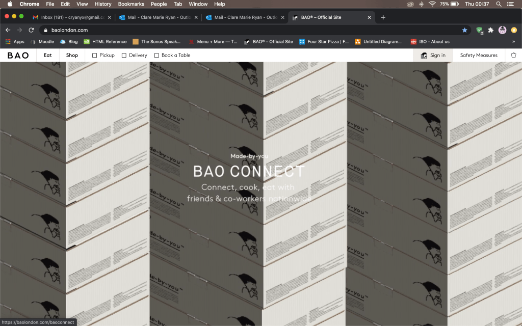
From the get-go, Bao London website is a beautiful one with a very artistic, trendy, lo-fi aesthetic that is at once fresh and exciting. In its homepage you are greeted (taking up almost the whole page) with a cool video of branded takeaway boxes stacking up on each other and covering the screen, illustrated with its distinctive lo-fi, pixelated aesthetic. I found that this is a video source (looped) with the code <div class=”video-wrap”> and the video itself is an uploaded mp4 file. I also like the crawler at the top promoting complimentary national shipping which is a text marquee, reminiscent of 90’s style HTML/CSS lo-fi websites.
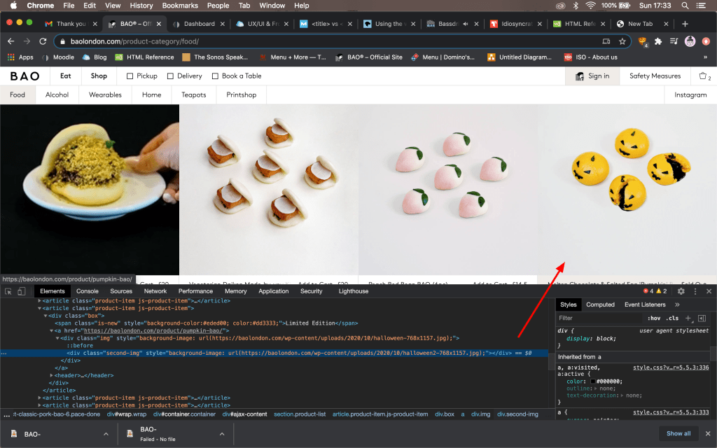
The overall colour scheme of the website is monochromatic with all the text and navigation menus in black and white. Navigation buttons have a simple rollover effect that highlights the area when your cursor hovers over. In the menu, some thumbnails use video loops (also uploaded mp4). I especially like that some items uses two images so that when your cursor hovers over the item, it changes to a picture of the food product, with a bite taken out of it. The code for this is <div class=”second-img”>. In the navigation bar, the website uses 8-bit type graphics, some animated gifs, for icons such as “Shop Home Kits” and “BAO Borough” which I find visually very well designed. I would like to additionally note that the website utilises minimal JavaScript.
In ChromeDev, Bao takes approximately 1.55s to load, and 7.77s to finish 36 requests. This is impressive considering the number of linked mp4 videos in the website. Unlike Thindi and Dominos, I did not find as many blocked scripts that attempted to load. Partly due to the lo-fi aesthetic, the linked videos on this website appear to be significantly compressed for optimal website performance. While you can notice some artifacting in the video, it is in sync with the overall design aesthetic of the brand. Photography on the other hand (ie. 720 x 972px) is quite large but superficially, does not seem to affect the overall performance.
2. Behaviour on Mobile Devices
On a mobile device, Bao London has a much longer load time of 18.38s on Fast 3G network. Most noticeably, the large video on the homepage is taken out of the mobile site and is replaced by a static graphic, “Bao Connect” which is the linked page for the video. The menu uses the same “second image” effect, such that the second image appears when you click on the link, as opposed to when your cursor hovers over. Images on mobile device access are well adapted for mobile screen and I don’t see any images cropped, stretched or awkwardly resized. The high-res images do not seemed to be scaled down for mobile access (as in Domino’s) which could potentially affect the performance of the site on mobile devices.
Bao scores 57% on Lighthouse for mobile device performance, fairing better than Thindi and Domino’s. The lead suggestion from Lighthouse is “serve images in next-gen formats” listing JPEG 2000, JPEG XR and WebP as image formats with better compression than JPEG and PNGs. It also suggests using an image optimisation WordPress plugin for a list of images that are relatively large in size and resolution, for a mobile network to load.
3. Accessibility, Usability & SEO
Bao appears to be well optimised by <meta name=”keywords”> tag with a list of 30 keywords. I would comment however that this is a little bit of keyword overloading as some keywords such as “dream drinks” have less relevance and the brand is potentially trading off relevance for traffic. I can see as well that the site has all the meta tags for description, title, site_name, listed and appears to be very thorough with SEO.
Bao is scored 83% for SEO by Lighthouse. Its main suggestion is to add descriptive text to links but I am guessing that these links without a description are the linked videos for which it may be unnecessary to add. Descriptive link text functions to help search engines understand your content. Lighthouse has also identified that [alt] attributes can be added for image elements. The alt attribute “specifies an alternative text that is to be rendered, when an element to which it is applied to cannot be rendered.” (REF: https://en.wikipedia.org/wiki/Alt_attribute) This is particularly relevant to this website considering several large, high-res images may fail to load on a slower and less reliable network.
