In this exercise we are given a sample client brief: a new brand who is looking for Web Design consultation to launch their new website to coincide with the opening of their new restaurant. The brief outlines three primary goals:
- Create an online experience to entice people to come in and visit their new restaurant in Dublin.
- Attract people to work for the restaurant.
- Providing the media with information needed to do an initial review of the restaurant.
The client brand DiMario’s is a wood fired pizza specialist, with a target audience of a younger demographic consisting of college students, news and social media, influencers, families and potential employees. The objective of the brief is to create a functional website that is interactive, clear and delightful to use while being accessible and adherent to modern trends. Here are some of the site features the client would like, outlined in the brief:
- Pages should include: Home, About, Menu and Careers
- Optimised for mobile device access
- Some drop-in interactivity
- Rich image gallery and PDF Menu download
In this part of the exercise I will be using Nielson’s 10 Heuristics to assess 3 brands similar to DiMario’s to conduct Market Research and Competitor Analysis. The objective of this exercise is to utilise the Heuristics as a tool to preliminarily examine websites according to a set, standardised grading system that can be done by the UX researcher, him or herself. As defined by Wikipedia, the term “Heuristics” is a term to describe “an approach to problem solving or self-discovery that employs a practical method…sufficient for reaching an immediate, short term goal or approximation.” (ref: https://en.wikipedia.org/wiki/Heuristic) The 3 brands that I have chosen for this research are distinctively different from each other, broadly covering the competitor market for DiMarios’s:
- Thindi – Dublin’s new, local Indian takeaway restaurant in Glasnevin
- Domino’s – Global household brand
- Bao London – A successful, award winning London-based food business owned by a personal friend of mine.
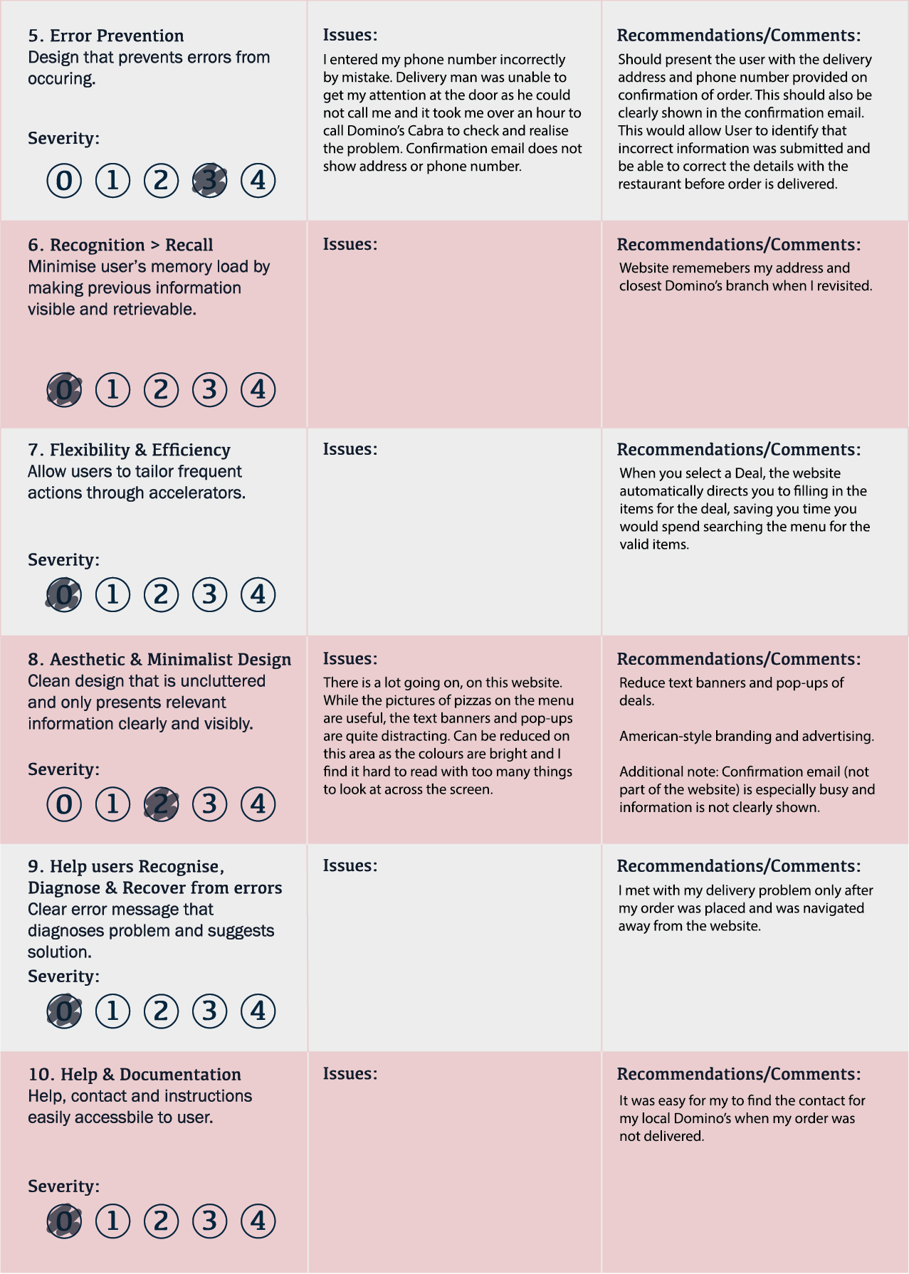
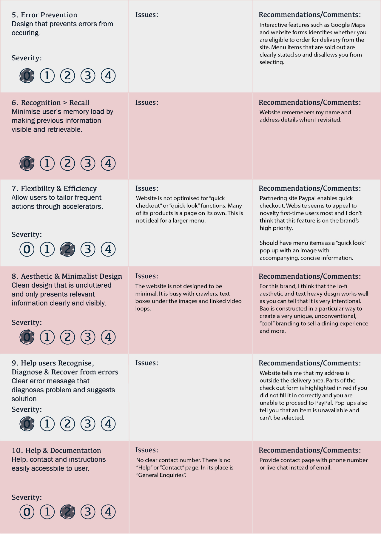
I have designed a scoresheet (please open image in new tab to zoom in) which will function as a checklist for the 10 Heuristics. On this I have noted down issues, comments and recommendations. After each brand assessment, I will highlight the pros and cons of the website, throwing a spotlight on key usability strengths and issues that I encountered while completing the user task of ordering food for delivery on the website.


Thindi Spotlight:
Pros: Clean, sharp and minimal design with strong and clear branding. Highly functional due to light to load and minimal design. I particularly like the informative and easy to navigate menu (on ordering page) accompanied by beautiful food photography to showcase the dishes. The photography of the dishes highlights #2 Heuristics, Match Between System and Real World, where the user can clearly see the dish and ingredients that they are ordering in the photo. Design clearly reflects the unfussy, personal, unpretentious but modern branding.

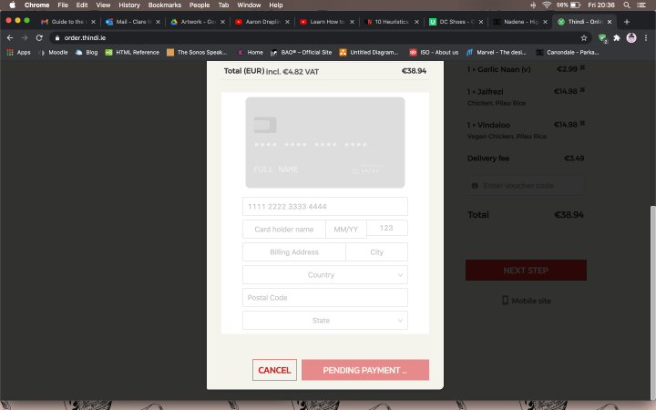
Cons: Menu on main page however is a Squarespace hosted png and can be improved by making it interactive, like in the (above mentioned) ordering page. I also noticed that the menu image has crop marks so this is indicative that it is inappropriately exported for web viewing- possibly originally a PDF for print, not optimised for web viewing. I had an issue with the payment system which I found unclear. Delivery site is separately hosted and does not easily connect back with main website and menu.
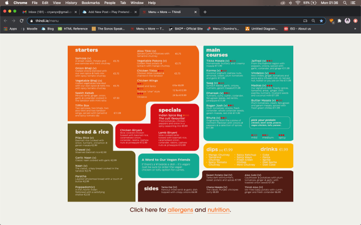
(Source: https://www.thindi.ie/menu)
(Source: http//thindi.ie)


Domino’s Spotlight:
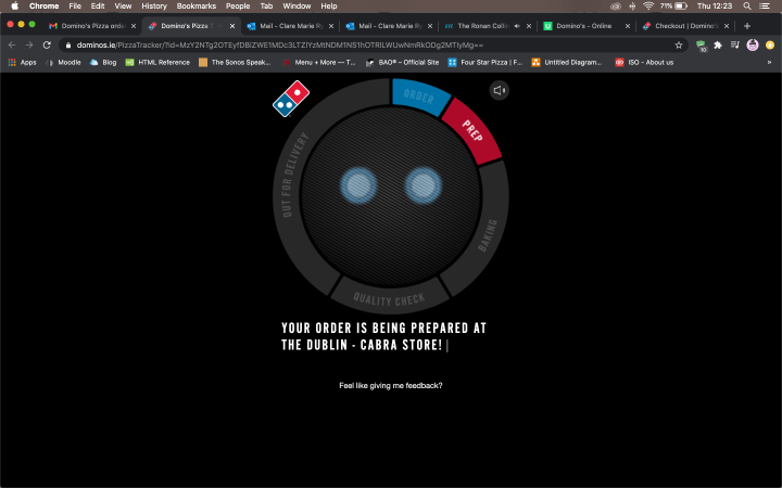
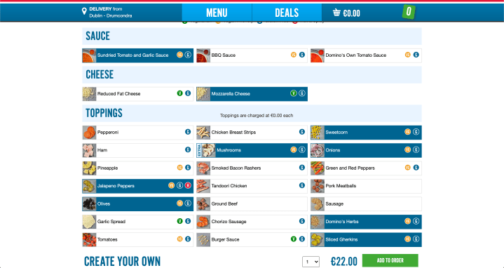
Pros: Delightful, effective graphics and animations throughout the website. The graphics are well used to support Heuristics #1 Show System Status, where it shows a screen loading and impressively, showing where your pizza is in the delivery order- from being prepared in the kitchen to on its way to your house. Website has a “Hiring” page much like the requirement in client brief. Ordering process was very clear with the help of images for each and every ingredient, especially through the “Make Your Own Pizza” process. This is an example of #2 Heuristics, Match Between System and Real World, where imagery, icons and lists are used to make navigation and ordering process clear to the User.
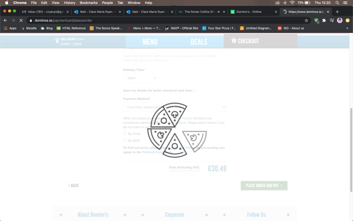
(Source: https://www.dominos.ie/menu/pizza/)
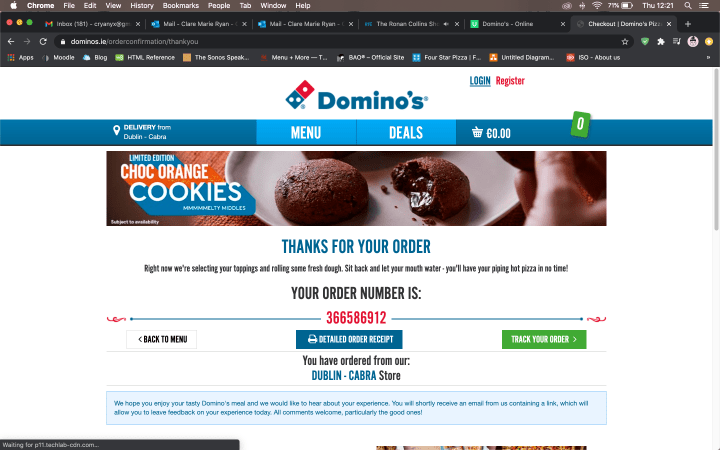
Cons: I had a major issue as the website failed to confirm my delivery address and phone number at checkout and the order was not delivered. I had to call the restaurant to find out what the problem was, causing inconvenience on both myself and the staff. The issue was that I incorrectly typed my phone number in which was my mistake, but I was unable to diagnose this because my provided contact number was not listed on the confirmation email and page. No matter how good the website was designed, this is a major issue as the food was not delivered and I did not know why. The confirmation page and email needs to rectify this problem by clearly stating the delivery address and contact number, that the User can check against.
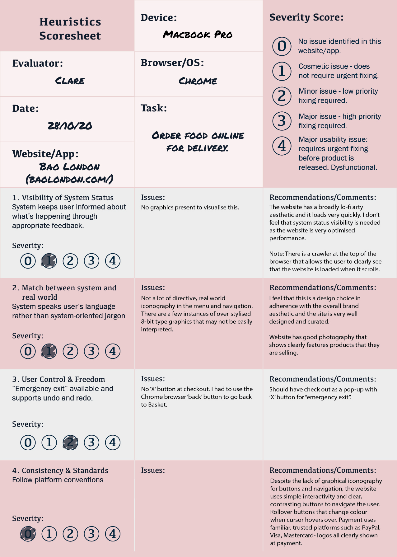
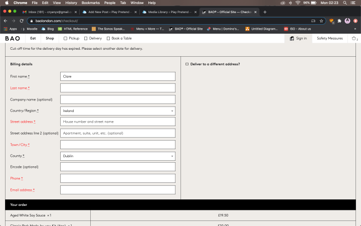
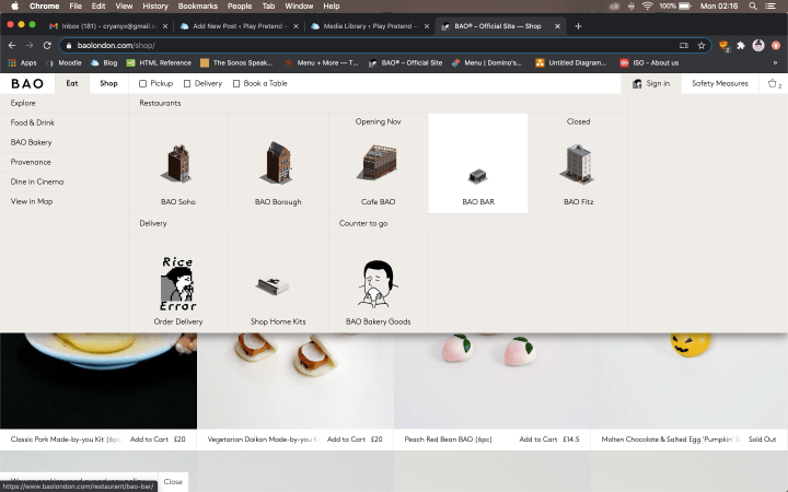
Bao London Spotlight:
Pros: Clever, unique branding and design curation throughout the website. From a design standpoint, I find this website exemplary and stand out for its unique and unconventional design choices which I find refreshing. I will give more design analysis in my later post, Part 1, Section A: UI/UX: Colour, Font Choice & Readability. Checkout and payment forms were clear to me while adhering to the lo-fi design aesthetic. Website also has a “Careers” Page.
(source: http://baolondon.com)

Cons: Website can be hard to navigate at points due to over-stylised graphics and lack of real world iconography. Website also tends to be quite wordy with less directive and navigational graphics and animation to aid the user along. The website is also lacking in efficiency and user control.
Conclusion:
In the process of applying Nielson’s 10 Heuristics in my UX Research, I learnt that while procedural and seemingly straightforward, each of the Heuristic rules have specific and nuanced differences that takes time to truly examine in any one case study. Many of the Heuristics overlap and a researcher has to be critical and specific, to objectively grade each of the rules.
While I found the Heuristics very helpful in preliminarily assessing a site, I think that it is important that they are viewed as effective guidelines that can analyse most, but not all brands and design. For example, my personal favourite of the three brands is Bao London which by the Heuristics, scored poorly. I feel that the 10 Heuristics does not account for artistry and some decision making that goes into design and brand identity of the site. Often, to be exceptional or truly novel and unique, one has to break rules. I agree that there are basic principles to adhere by in UX, but there is always room to be bold with design choices, whilst always keeping the User in mind. The Heuristics is also unable to comprehensively assess technical construction and functionality of the website, lying on the web development end, which has equal importance in the success of a website / app. In conclusion, while effective and useful, The Nielson’s 10 Heuristics also has its limitation that a UX researcher should not fail to acknowledge.
