In this week’s class, I was able to get some client feedback. Here were several issues raised after presenting my initial prototype:
- Checkout / Order page had too many headers that were visually contending for attention (cognitive overload). I need to better differentiate the order section from checkout.
- Date and time of “Last Order” should be added.
- Minimise paragraph on About page as it is too wordy.
- Add Value Proposition on Homepage. Client likes the description of “fresh, local, all-Irish produce” written in About page. This should be added to the homepage to identify a unique selling point of the brand.
- Reposition “Last Order” and “Favourites” button to be above the “Meal Deals” banner as it better serves its purpose for convenience and speed for regular/ returning customers.
- Change “You” login page to “My Account” as the indication of “You” is vague and unclear.
- Add more interactions to better illustrate and portray navigation and UX of the final product.


5. Repositioned recall buttons to above Meal Deals banner. 6. Changed “You” page title to “Account”.
On interactions, I added more to the prototype, where buttons can be clicked when XD link is accessed on the laptop browser. I enabled the heart button (to add menu item to “favourites”) to change colour when clicked. Items on the order page can be removed and the number of each item can be toggled slightly. I tried to use Anima plugin to add editable forms but the sharing link did not work well and changed my layout design. I would like to note however, that not all of the added interactions were present when the XD link was accessed from a mobile device and the hearts could not be clicked. Please access my revised prototype on the following link:
Having updated my prototype as per client’s feedback, I then tested the prototype on a volunteer. For qualitative tests, Jakob Nielsen recommends that 5 people are enough to raise crucial usability issues (ref: https://www.nngroup.com/articles/how-many-test-users/). However, due to Covid 19 restrictions, there are many limitations now, on conducting a User Testing with multiple volunteers, and in person. I tested my prototype on one person, someone who I live with, that satisfies some traits of the target audience defined in our Client brief: “Younger population, college students, news media, bloggers, families, potential employees.” I created a User Profile for this volunteer, Darius:

Part 1: Contextual Questions:
- Qns: How do you define a good dining experience?
Ans: Food quality, prompt delivery, large portion sizes, affordability, available vegan and spicy options, locally sourced, quality ingredients. - Qns: What kind of food do you like & why?
Ans: Indian and Eastern food. I like the flavours and spices in simple, fresh cooked food. - Qns: How much would you spend on yourself for a meal?
Ans: Takeaway €15 (incl. of delivery), Dine-in €25.
Part 2: User Scenario & Task
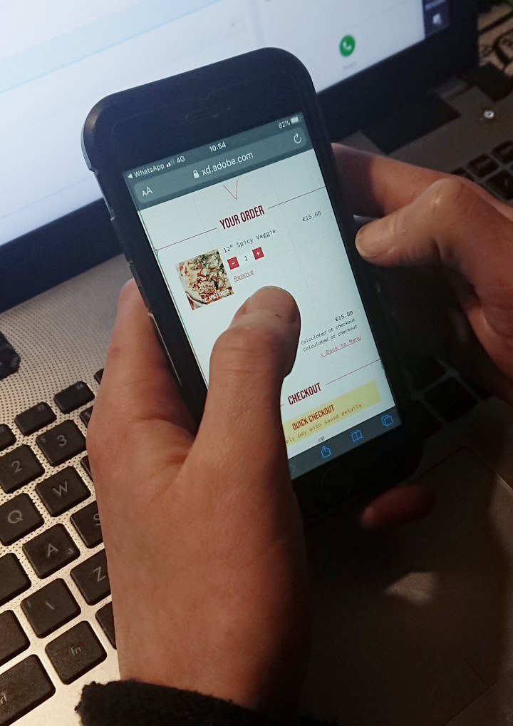
Scenario: It’s Friday night and you are home alone from work and you have no outing plans with friends. You are hungry and you would like to order a pizza, accompanied by a beer and stream a Netflix movie on TV to wind-down.
Task: Order a pizza on the prototype.
Result: User successfully ordered something picked out from the menu in 3 – 5 minutes.
Part 3: Evaluation
- Qn: On a scale of 1 – 5 stars, how many stars would you rate this prototype?
Ans: 4 Stars. - Qn: Please list some things you enjoyed/ appreciated about the prototype, and some pain points in your experience.
Ans:
Pros: Fast and uncomplicated process. I like the concept of the mystery boxes and would order it in real life. I appreciate the ingredients clearly listed for my information on the menu. I like the concise, smaller menu which makes choosing my food easier.
Cons: I was unaware when an item is added to cart- this can be clarified with a pop-up or graphic indicating number of items added to cart (live-update). There is no field to add notes to your order such as “make pizza extra spicy” or “no pickles please” etc. Does not display delivery time on completion of order. There should be a note on allergens such as “please feel free to contact restaurant for more information on allergens.” Contact number should be present at the footer of every page for better accessibility. I do not like the colour pink as it is pale and I do not associate it with pizza. - Qn: Would you recommend this product to your friends?
Ans: Yes. - Qn: Please describe the prototype in 5 adjectives.
Ans: Pizza, Restaurant, Modern, Easy, Straight-forward.
(Reference for User Script: How To Run A Remote Usability Testing, https://uxdesign.cc/how-to-run-a-remote-usability-testing-4350c7786f20)
Conclusion:
As I only tested the prototype on one volunteer, I did not make a table for Task Success Rate as I have no other results to compare to. I however listed the comments, feedback, suggestions and pain-points identified, above.
In concluding this exercise- there were several strong points that were raised by Darius, that I would not have thought of have I not conducted a User Testing. I realised that User Testing helps the UX designer see through the eyes of a person different from him/ herself, understand another’s needs and frustrations. In the case of Darius, he had very specific dietary requirements (vegan) and preferences (spicy). To help the product be inclusive of people like Darius, there should be a notes section where you can add a note to your order at checkout. This is definitely something that I would like to add to the final product.
There should be more live updates when things are added to cart although I would have to admit here that I may be unable to do this by myself with Java Script, and the prototype cannot to my lone abilities be fully functional with live cart and checkout. While a prototype should be as close to the final product as possible, its limitations where present, may be needed to be described to a volunteer before the user task is executed.
I would also like to add more critical information such as restaurant contact number to the footer of the website, present in every page. Lastly, I would take Darius’s distaste for the pink background with a pinch of salt as colour choice is a design aesthetic that is subjective. However, if the testing was conducted with multiple users, and if the feedback from more than one user has identified the pink background as a UX disturbance, then I would have to consider pink to be an inappropriate choice for this website.
