Having done my competitor analysis and background user research, I have decided to name my product Gig It by Press Up, encapsulating the client brand with a snappy (hopefully catchy) name. In short, Press Up Entertainment is a hospitality group operating cinemas, hotels, pubs, retail and restaurants based in Dublin, Ireland. Venues such as Workmans and Liquor Rooms which Press Up operates furthermore books and hosts gigs and live events. A dedicated music app hosted by Press Up will therefore firstly benefit the local music scene and community, and secondarily generate interest and patronage to its venues. Coming from a graphic design background, I was eager to create graphical assets for groundwork corporate branding. As I have done in my previous assignment (Di Mario’s Artisan Pizza), I designed a logo using the fonts present in the existing Press Up branding, Bebas Neue (logo primary font) and Futura (secondary font). I used material.io colour tool to select primary and secondary colours, which organised for me in a hex colour palette that I can easily pick from using the eyedropper tool while prototyping.

Taking cue from Spotify and by user and personal preference, I have opted for a dark mode or dark theme, which has especially gained recent popularity since becoming a settings option on Apple mobile devices (iPhone, iPad) in 2019. I then hit the ground running by designing rapid lo-fi wireframes on draw.io.
Accompanying these wireframes, i did some high fidelity mockups (not yet prototype) on Adobe XD.

At this point I realised that I have not been designing with the user in mind and was unable to iterate because I had not conducted any lo-fi user testing or yet gained client feedback. I should have tested the wireframes and gathered user/client feedback for the branding before proceeding with prototyping. It was back-tracking a little but I conducted a user testing with my colleague Brian.
Brian is a music enthusiast who would use this app as a music listener and gig attendee. He would like to discover new local bands and be updated on their touring schedule. He is a graphic designer, plays music leisurely and played in a band several years ago. Hence I felt that he would be attuned to music-themed design and media app functionality, and would be a good person to test my product with. The testing was conducted on Microsoft Teams and we screen shared and Brian recorded the session with a plugin (Screencastomatic), video of which I used to refer to in my evaluation. Using my published link from draw.io, I tasked Brian to browse and look up information on a new artist and listen to his/her tracks. At this stage, I told him that the prototype was only lo-fi and the links were not yet fully functional, but to highlight any pain points he experiences in navigating the app.


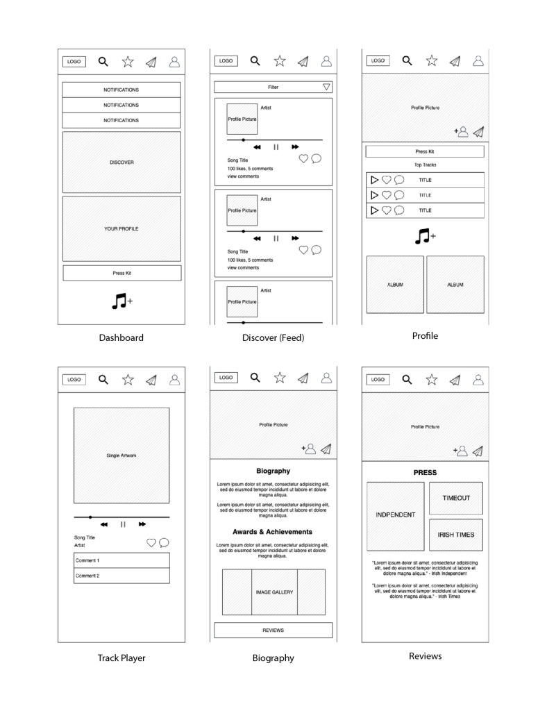
The feedback and Pain points are as follow, in accordance to each of the pages, and then generally:
- Dashboard: Misread the star icon on nav-bar as “Favourites” when it is meant to be “Discover”
- Did not understand “Press Kit” – could be changed to “Biography”
- Profile: Found it strange that the profile picture is in landscape orientation as he feels that most profile pictures are square
- Track Player: No back button from track player page (essential)
- Discover: Filters function (not yet added to the prototype) was not clear- possibly because it was under-developed or not sufficiently indicative
- Biography: Clear and readable
- Social media icons too large- stands out unnecessarily- too bold
- Missing Twitter
- Reviews: “Pretty cool”
- Overall: Missing page for ALL local gigs / calendar of gigs by locality
While a lo-fi user testing would have concluded here, since I have already designed (in hi-fidelity) some of my prototype, I sent Brian a published link for my Adobe XD prototype and requested for feedback on design, colours and overall visual criticism:
- Would have preferred the splash screen to be all red background with black logo- more similar to original Press Up logo
- Secondary colour yellow a little distracting- disturbs visual hierarchy
- Should have Press Up red at the bottom of the interface to weigh down the nav-bar (design principles)
- Biography page: Too many colours – what Brian sees is Dark grey/blue (background), red (two tones), yellow, white…
- Biography page: Centred text looks surprising – justified to left may be more readable for text heavy pages
- Login page: Could use placeholder text in the form
Incorporating this highly valuable feedback gathered from my user testing, I have completed my wireframes with the changes informed by Brian’s comments to create the following User Flow Diagram:

 Play Pretend