Colour
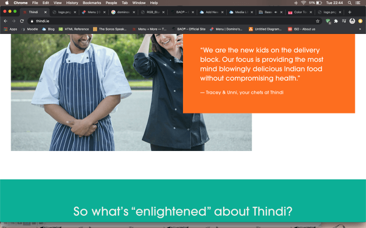
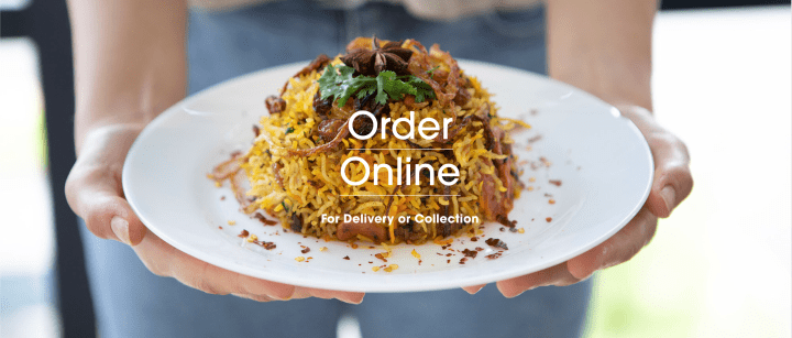
Thindi adopts a complicated, contrasting colour palette for its website. While its logo uses Red and Yellow, these colours are not referenced in the website. Instead, I find Orange (#fc6e1f) to be the primary colour even though it does not command the most visual weight on the page. I come to this conclusion because the key buttons (Order Online) are coloured Orange to draw attention and it is the first noticeable block of colour on entering the homepage. Moreover, Orange seems to have been used to match a lot of the food photography of their curry dishes. I find orange to be quite a common colour used on food websites (ie. JustEat), as it is an organic colour found in food, although on Thindi it is much brighter than organic. Orange is appropriate for an Indian takeaway as it evokes a sense of heat and spice in cooking. The brightness emotes energy and optimism, feelings of which consuming food should give you.
There are blocks of two other colours on this homepage- Turquoise (#14a892) and a deeper Maroon at the footer (#4f0504). On the colour wheel, the contrasting colour for Orange is Blue so Turquoise is theoretically a good choice for a secondary colour for contrast. However, this scheme is a complicated one coupled with a tertiary Maroon colour, none of which are in the brand’s logo. I appreciate the bright pops of colour throughout this website but I feel that the choices are disparate and can be unified more so as to not distract the eye while navigating through.
My suggestion for design improvement for Thindi’s website is to use the logo’s Red as the primary colour and Turquoise as its contrasting, secondary colour- used only as an accent. Maroon should be used as a darker complimentary colour to the primary logo Red, perhaps just for text or on a smaller footer and or navigation bar (refer to below diagram).
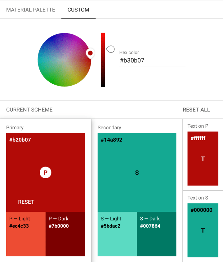
(Source: Material Desing: Color Tool https://material.io/resources/color/#!/?view.left=0&view.right=0)

Of the three brands, I find Domino’s to most effectively use colour in its website to reflect brand identity. The site has a dominant colour of Blue (#0076AB) and secondary colour Red (#E31837). These are clearly the same two colours used in its logo. The first thing that strikes me about Blue and Red in branding is the reference to the American flag. There is a clear Americana reference (to me) in the website’s branding, coupled with the pop-ups, striking fancy fonts, animated pop-ups… it reminds me of American television. I do not find this random, as Domino’s is an international brand known for fast-food, American-style pizza.
The website has a good visual balance of Blue and Red throughout the page, on a plain white background that creates a good canvas for the colourful thumbnail pictures of pizza. There is clear contrast and the website also uses an accent colour of Green (#41A934) which is also a common colour choice for food as it evokes vitality and health. The Green is aptly used to promote the menu’s new range of vegan pizzas.
Unsurprisingly, based on my earlier analysis of the three brands, Bao has the most unique colour coordination on its website- opting instead for a more pale monochromatic scheme. On Bao’s homepage, I can see 3 background colours on the layout. The most dominant colour is a Warm Grey (#EFECE8) followed by White and a Cool Light Grey (#D7D7D7). Being so monochromatic, nothing clashes. I anticipate that their designers chose this pale canvas palette to firstly match the colour of the core food ingredient in Bao’s menu- bao (bread in chinese). Secondly, it provides a blank canvas to feature full-screen videos and animations which the website seasonally puts up for promotions.
The default homepage video is an animation of takeaway boxes stacking up against a sky blue background- all very easy-on-the-eye and unobtrusive colours. While I find the use of pastel colours and grey to be on-trend and edgy, it runs the risk of looking dull, visually flat and boring which in this instance pays off. On its Menu and Shop page, there is a strong use of Black and Yellow for accents and highlights. This is striking as the yellow is used appropriately sparingly, saving itself for attention grabbing “Limited Edition” banners, with the text in Red. Red and Yellow are frequently used as a colour accent to grab the attention of the viewer, sometimes to alert and warn of danger. This is effective for the “Limited Edition” or “Sold Out” messages, making the item come across as exclusive and gives the User a sense of urgency to buy it before it sells out or is removed from the menu.
I have used the term Lo-Fi to describe this website a lot in my previous analysis and the colour palette is no exclusion from this description. I appreciate the cool, sparing use of colour alongside relevant videos, animations and photography, creating a modern, minimalist design that makes it unusual (in the best way) to its food industry competitors.
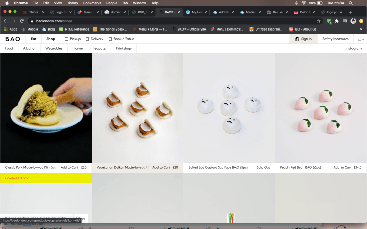
(Source: https://baolondon.com/shop/)
Font & Readability
Size & Scale
In Thindi’s website, I appreciate the large scale food photography that greets you, obviously to entice your appetite and to feature their hero dishes- curry. However, I find the website too oblong with equally large blocks of colour that are quite empty. I don’t find this to be an effective use of visual space. Moreover, I find the font size a little too large for descriptive text, having little difference from its headers, achieving little hierarchy of information. It gives a sense that the designers were attempting to occupy space more than effectively using it to direct the user to order food. The logo I find can be enlarged more for greater representation of brand identity. At the moment it looks lost amidst the picture gallery.
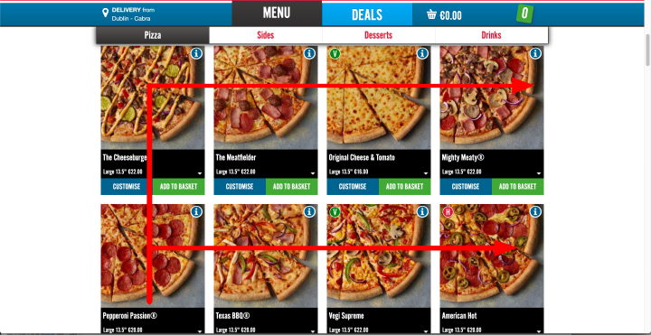
On Domino’s, the layout adopts a more list-like menu with the logo and promotions well, sizeably featured at the top followed by thumbnail pictures of pizzas listed below. The website is well balanced with good attention given to banners, pop-ups and promotions. It is easy to navigate to order food.
Bao London has its text too small in my opinion. It is hard to navigate when the drop-down menu buttons have a small font size (14px). The layout can be better improved with a greater variety of font sizes and spatial use to differentiate between headers, descriptions and buttons. The homepage however well features its 3 directive promotions- Bao Connect, Made-by-you Kits and Bao Bakery Goods. It is hard to miss these three sections with text clearly legible on pictures. This detail should be applied throughout the website’s navigation.
Colour and Contrast
There is good clarity of text on Thindi website with sans serif text in white, on strong coloured background colours (orange and turquoise). On its menu, it uses a simple rollover effect where it “highlights” a dish when your cursor hovers over, making the background darker than the rest of the page. This is a good example of clean, clear contrast being used with strong colours. As aforementioned orange and blue (close to turquoise) are contrasting colours on the colour wheel.
Similar to Thindi, Domino’s also has clean, clear and contrasting buttons that makes navigation simple and easy, using its core colours of blue red and white.
Despite its monochromatic colour scheme, the use of blocks of black, yellow and red (text) as accents is effective in drawing attention to specific items on the menu. Having a largely pale and white background makes its simple black text clear and legible.
Playing with Perspective
There is little play with perspective on Thindi and the website is mostly graphically plain and flat. Some food photography has a soft blur which makes the overlaying white text more prominent.
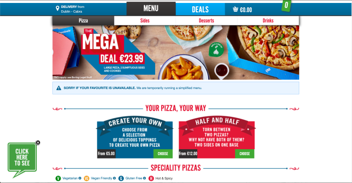
Domino’s as well has little play with perspective due to its list-like, practical layout. One feature stands out for this- the Mega Deal banner (image reference below) where the picture has a soft blur, allowing the MEGA DEAL text in a fancy block-lettering to feature clearly.
I cannot identify much play in perspective on Bao London website, perhaps in-vein with the graphical lo-fi aesthetic.

Viewing Patterns
Thindi has a clear Z-viewing pattern on its clean bright layout.
Domino’s has a Z-viewing pattern followed by a F-viewing pattern on its thumbnail menu when you scroll down.
Bao London has a Z-viewing pattern on its homepage and a F-viewing pattern on its Shop and Menu page.
Harnessing Typefaces
I can only see the use on one font throughout Thindi’s website a sans serif font- avante garde gothic pro. It does however use two typefaces, Strong and Regular to differentiate the sub-headings from the descriptions effectively.
Domino’s uses three core, basic fonts- Arial, Helvetica Neue and ATF Alternate Gothic. The same fonts are used in varying typefaces- narrow/condensed, regular, bold/strong, thin/light etc… this is an effective way of showing hierarchy of information especially on a page loaded with information, while keeping the layout design tight and unified.
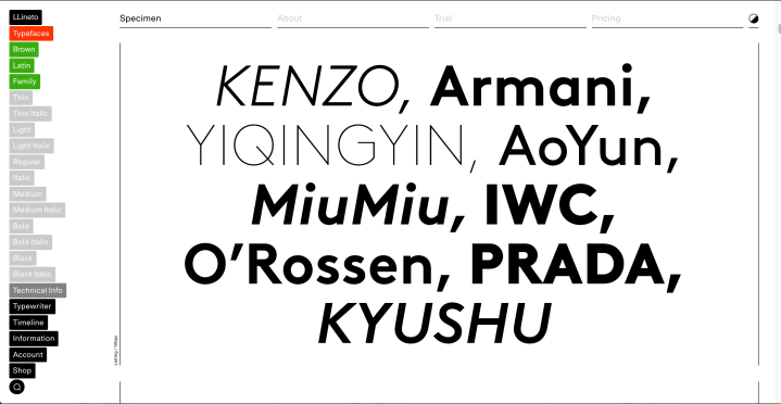
Bao uses primarily one font throughout the website (LL Brown) with little variation in typeface. This is an opportunity missed as the font has a variety of faces that could have been utilised to better showcase text, description and information hierarchy on this website, especially when a lot of the text runs small.
Texture & Tone
On Thindi, there is an attempt at texture and tone where the ORDER ONLINE text overlays the food photography on the homepage. This is not very effective as the text is lost in the picture and more can be done to define the text perhaps with a bold typeface, change in colour or a drop shadow applied to the text, done by uploading the title text as a PNG export with a transparency layer.
There is not much example of the use of texture and tone for readability on Domino’s website. There is one instance where arguably this is used and that is the block fancy font overlaying the picture of MEGA DEALS (above REF 4).
There is some examples of texture and tone used for Readability on BAO website in the home page. Like Thindi, it overlays text on images and also video (BAO CONNECT). Similar to Thindi, I find this not very effective as the text is in white on a pale tone image so it does not stand out as much as it should.
Balance & Symmetry
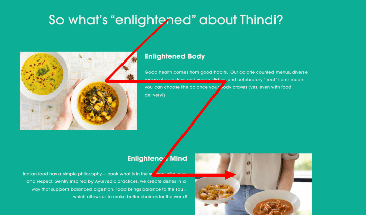
There is good balance and symmetry in the layout of Thindi. As shown in REF 9 (above), the image is symmetrical and the text overlaying the dish gives an effect that the text is being presented to the User on a plate. I also like the alternating left and right alignment of the sections with centred headers, when you scroll down that while refreshingly unconventional, is still overall balanced. This reminds me of the same kind of layout used in publishing such as newspapers and magazines.
Domino’s uses a very clean centred alignment throughout its menu that is clear for the user to navigate and remain visually unobtrusive.
Like Domino’s, Bao London has a centred layout that is symmetrical and balanced.
Alignment on Screen
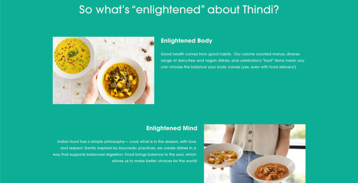
I like the varying alignment of sections of Thindi’s website. As mentioned, it chooses an alternating left and right alignment of sections (REF 10). The corresponding, accompanying text to each of the pictures have a close proximity and alignment to the picture ensuring a clear message.
There is nothing I can find that stands out for the use of alignment on screen and proximity of elements besides quite a standard layout on Domino’s.
While most of the layout is quite standard and basic, there is a section on Bao website that I found visually exciting. For each of its restaurant outlets, their food and drink menu is listed in graphics with food on top and drinks below. The User can then scroll down the food and drink which aligns each drink with a different dish. It gives the Use suggestion through visualisation, of drinks that can be paired with the food dishes. I find this creative and refreshing in a restaurant website with an element of interactivity, like a computer game.
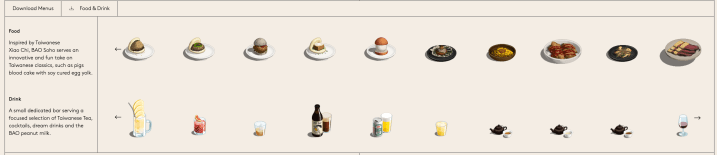
(Source: https://baolondon.com/restaurant/bao-soho/)
Effective Use of Motion
There is some sense of motion achieved in the picture gallery on Thindi’s website where the images changes by itself. On its ORDER ONLINE page, the background colour of the dishes darkens when your cursor rolls over achieving a sense of interactivity.
There is not much use of motion on Domino’s website besides the rollover effect applied to its buttons. There is also a simple animation of fireworks on the pop-up promoting its new vegan pizzas, catching the User’s attention at the corner of one’s eye.
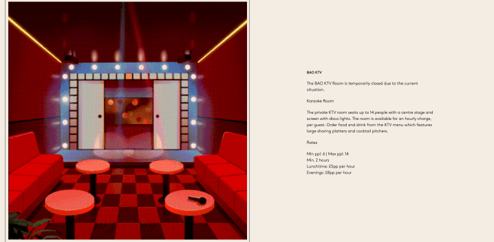
Of the three case studies, Bao London most heavily uses motion graphics and animation on its website. These are uploaded as compressed videos. On its menu, the pictures of the items changes to a different perspective when your cursor hovers over. This is cool as it looks like you are turning the item or touching it, much like you would in a shop when you are looking at items on a shelf. I especially enjoy the use of gif animations to visualise spaces in its restaurant outlets.