At the prototyping stage, I designed a logo for Di Mario’s branding, paying attention to the target audience outlined in the sample client brief:
“Younger population, college students, news media, bloggers, families, potential employees.”
(Sample Client Brief)
For the design and overall aesthetic of the branding and website, I wanted to adopt a clean, sharp and minimal design approach. I wanted to design something that had the trendiness of Bao London’s website, adding more colours and integrating the clean, minimal layout used in Thindi, alongside attractive and stimulating food photography. I liked the practicality and functionality in the Domino’s website, so I made similar layout design choices especially for the Menu page. I wanted to use bright pastel colours while keeping the representation of food on the website appetising and organic. On colour scheme, my immediate choice of primary and secondary colours were Terracota Red (primary) (#d33226) to reference the tomato sauce as a pizza topping, and a yellow-ochre (secondary) (#edb129) for cheese. I then entered my chosen colours in Material Design Color Tool (material.io) and was presented with the following scheme:
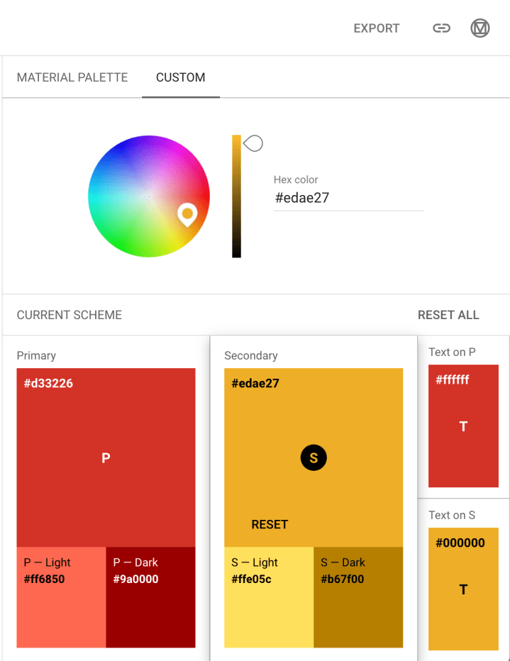
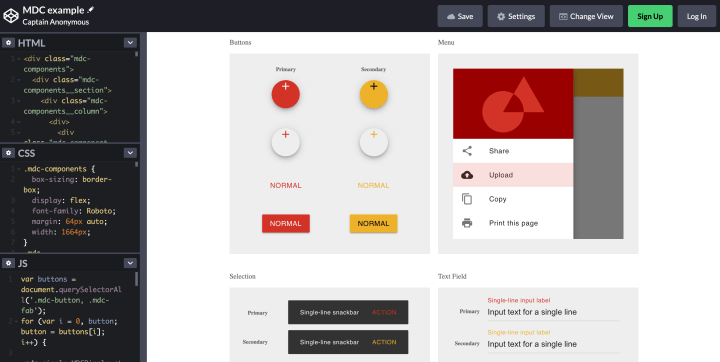
This is a very powerful and useful online tool for picking UI colours as your colour scheme can be exported as mockup layouts in code (codepen.io). These are useful tools for fast colour-picking and visualising design choices to clients:
From here, I picked a light (pink – #faecee) and a dark (deep blue – #1e1e20) background colour and tested the logo against the two colours. I chose to go with dark content against a pale background for my prototype although this is subjected to change, depending on the client’s feedback and comments. Lastly the fonts I used in the logo were Bebas Neue (Google fonts) and Mrs Saint Delafield (Google fonts). The script font was used in the logo to denote “Artisan” while Bebas Neue is a strong and impactful font to which I applied a subtle grunge texture, to reflect the rusticness of a wood-fired oven. These are parts of the branding identity that the client specified they want portrayed in the website. For the content of the website I chose to use Bebas Neue for headers and Source Code Pro (Google fonts) for paragraphs. It can be noted that Source Code Pro references the lo-fi design aesthetic that I appreciated on Bao London’s website.
Finally, for the prototyping, I decided to use Adobe XD as it is an industry-standard program and as a designer I am comfortable with working in the Adobe Suite. I found the program very intuitive and was pleasantly surprised at the auto-animate effects that the program applies to your screen transitions, easily dressing up your prototype for the client. Please find the following link to my preliminary Di Mario’s website prototype, which can also be easily accessed on your mobile device:
This will be tested by my tutor acting as the client.
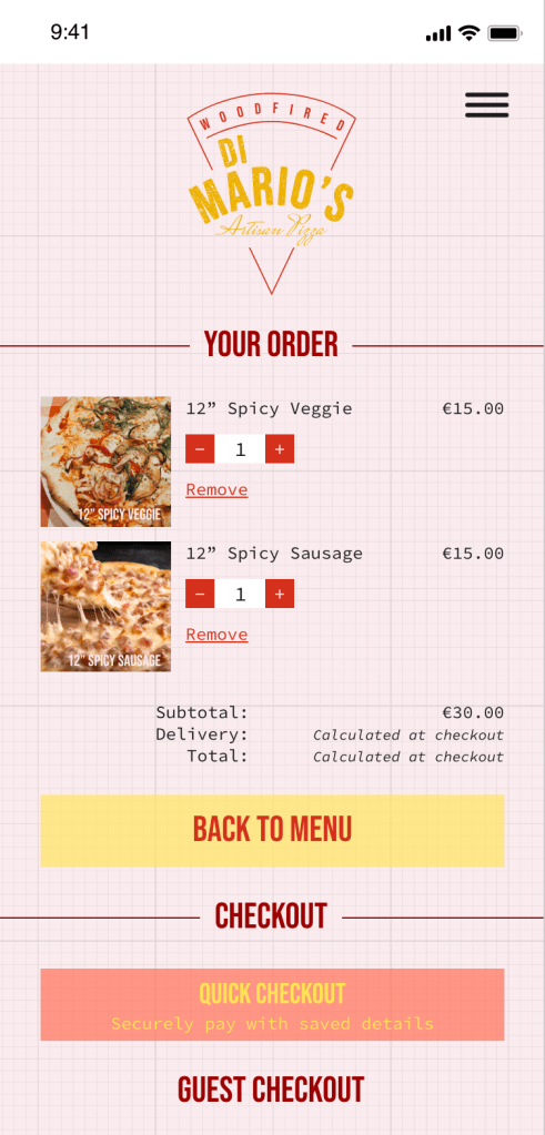
I would like point out in my design, instances where I attempted to resolve User problems raised in my last post:
• Quick checkout and recall options to optimise speed of ordering.
• Option to “heart” or favourite a menu item.
• Ingredients and allergens listed on menu in text.
• Novelty functions such as “Mystery Box” to delight the adventurous User.
• Promotions and Discounts for regular customers.